Design · Trend · 8 Sept 2026
Dulux opens the 2027 colour season with Soulful Sage
AkzoNobel's research points to lighter, calmer rooms as an antidote to information overload, and its answer is a soft, silvery grey-green.
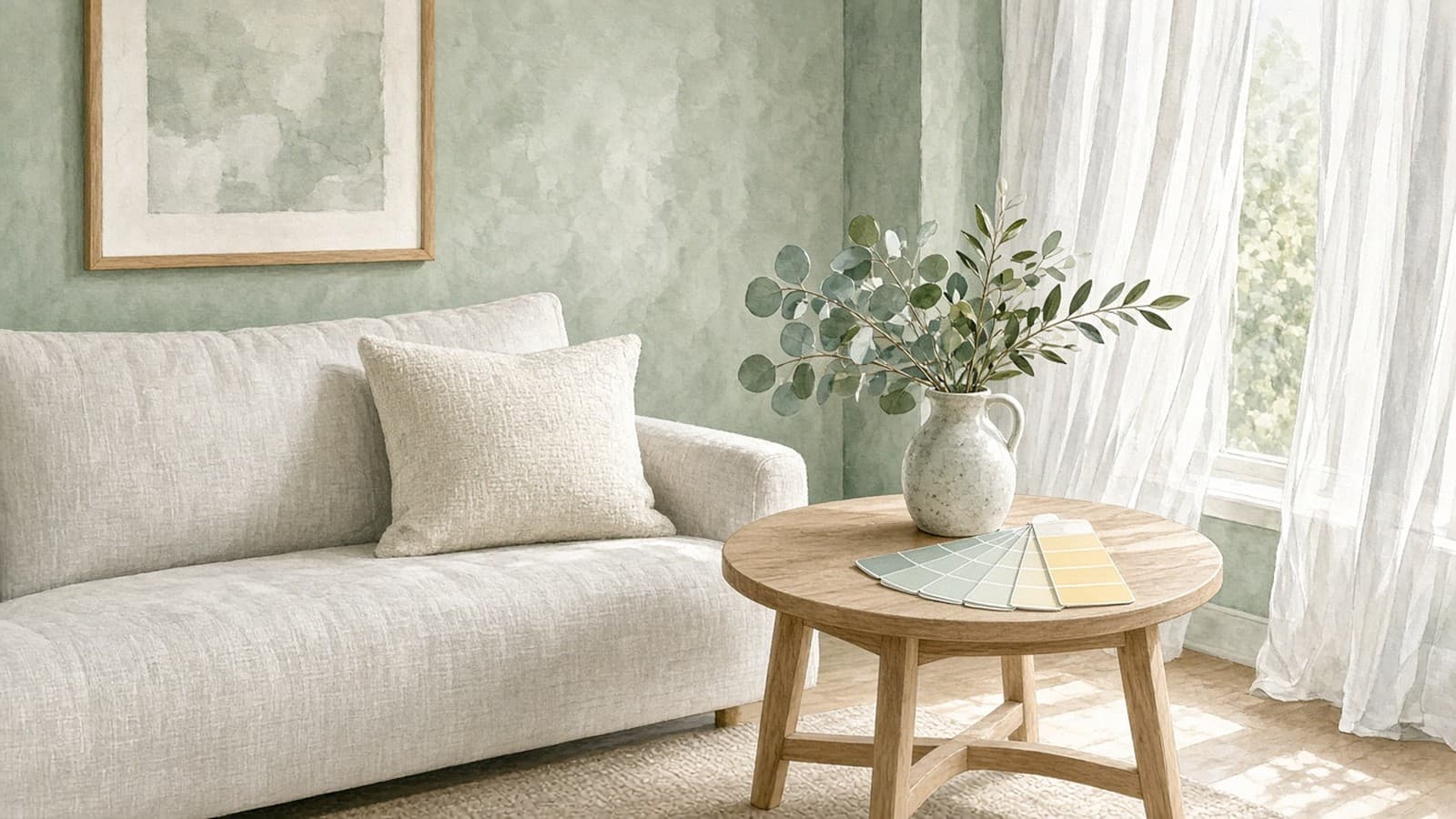
Illustration: FeelArtsy Studio (AI-assisted)
Colour-of-the-year season has a starting gun, and this year Dulux fired it. On 8 September the paint brand, part of AkzoNobel, named Soulful Sage its Colour of the Year 2027. It's a soft, slightly silvery grey-green that the company describes as calm and uplifting, and as a flexible base for a scheme.
Where it comes from
The pick isn't a stylist's whim. Each year AkzoNobel runs a research programme it calls ColourFutures, which tries to turn social and design trends into a usable colour direction. For 2027, Dulux says, that research found people moving towards lighter, more considered spaces. It sees this as a response to information overload and a wider sense of global uncertainty.
That framing is worth noticing. Last year Dulux chose not one colour but a trio of blues called Rhythm of Blues. Pantone's current pick, Cloud Dancer, is a quiet greyish white. The mood in colour forecasting has been heading towards restraint for a while, and Soulful Sage continues that.
Dulux also pitches the shade at professionals as much as homeowners. In its words, it can be pushed warmer, more neutral or more energetic depending on the brief. Architects and designers like a colour like that because it rarely fights the furniture.
Why sage keeps coming back
Sage is one of those colours that never quite goes away. It's the green of herbs, lichen and olive leaves. It sits between grey and green, so it behaves like a neutral but still feels alive. In a north-facing room it reads cool and silvery. In warm light it softens towards putty.
It also pairs easily. Think chalky whites, pale oak, linen, and a single accent of butter yellow or terracotta.
The start of a green year?
Dulux was first, but probably not alone for long. Paint brands release their colours of the year over several months, so expect more announcements this autumn. We'll be keeping score.
Bringing it home
The simplest way to try sage is in pictures and textiles before paint. A few botanical prints with silvery foliage, a misty landscape or a eucalyptus wreath will tell you quickly whether the colour suits your light. If it does, the wall can follow.
Palette
- #A3B5A0
- #F4F2EC
- #D8CBB0
- #E9DE9A
- #5F6F5C
Sources
Written by FeelArtsy in our own words. AI may assist the draft. A person reviews it before it is published. See the editorial policy.
From the shop
Prints related to this story. House lines, designed by FeelArtsy Studio.
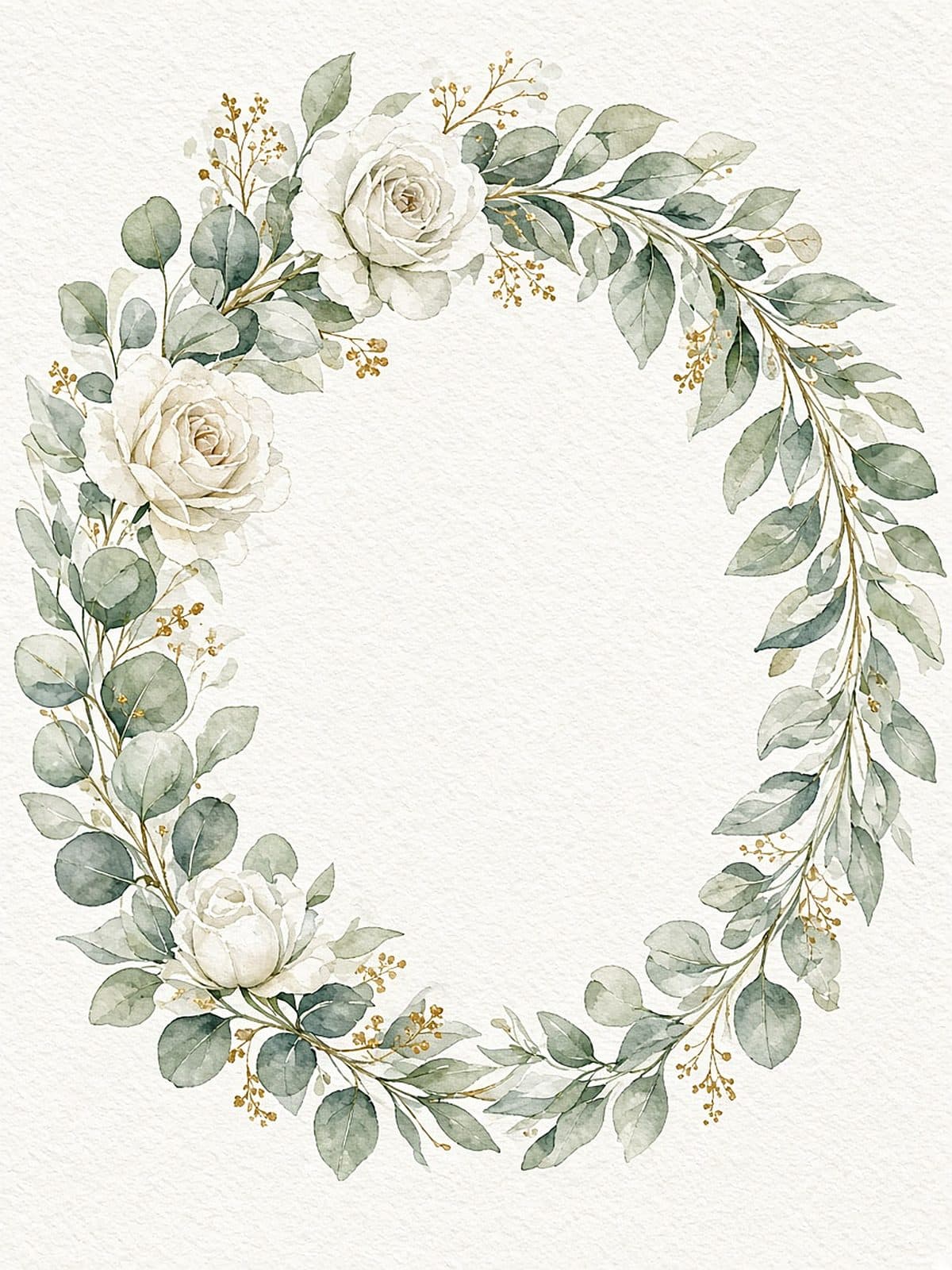
Eucalyptus Wedding Card
Lumen Wash
€5.50
A FeelArtsy Studio line
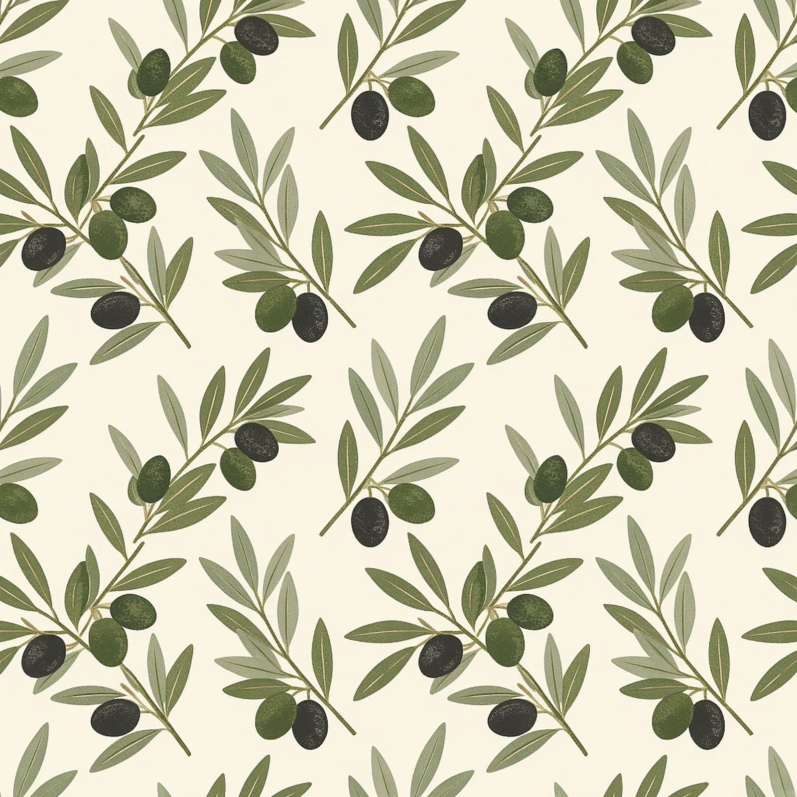
Olive Grove Art Print
Still Form
€24.00
A FeelArtsy Studio line
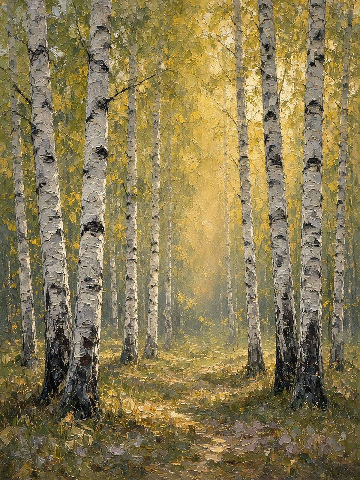
Birch Light Canvas
Field Pigment
€59.00
A FeelArtsy Studio line

Get the weekly trend letter
One letter a week on art, design, science, and what we printed from it. We store your address as pending and send a confirmation before the first letter. That confirmation email is not going out yet.